Not so long ago, a brand was something you printed. It lived on business cards, letterheads, brochures, signage, and the occasional billboard. The screen was secondary; a place to put your logo and your phone number, and not much more.
That world is gone. Today, for the vast majority of businesses, the first time someone encounters your brand is on a screen and more often than not, that screen is a phone. Your website, your social media presence, your email signature, your app, your digital ads, these are where your brand does its work. Print still has its place, but it’s no longer where brands are built.
This shift has significant implications for how brands are designed, and a lot of businesses haven’t caught up yet. A brand built for print with intricate detail, complex colour relationships, and a logo that only really works at A4 or bigger, is going to struggle in a digital-first world. Here’s what digital-first branding actually means, and what it should look like in practice.
What digital-first branding actually means
Digital-first branding isn’t about ignoring print. It’s about designing with screens as the primary context and treating everything else as a secondary consideration. It means asking, before anything else: how does this look on a phone? How does it work as a favicon? How does it hold up in a social media profile picture at 40 pixels wide? If the answers to those questions are good, the brand will almost certainly work everywhere else too. The reverse is rarely true.
It also means thinking about motion, interactivity, and context in a way that print never required. A digital brand isn’t just a logo and a colour palette, it’s a system that has to perform across an enormous range of touchpoints, sizes, and environments, often without any human intervention deciding how it’s displayed.
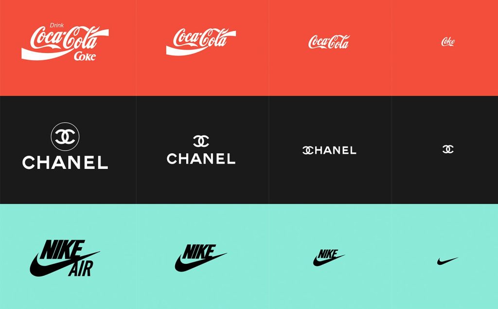
Responsive logos: the same brand, not the same file
One of the most important practical shifts in digital-first branding is the move to responsive logos. The idea is straightforward: rather than one logo file that gets scaled up or down, you design a family of logo variants that are each optimised for a specific size and context.
At full size, say a desktop website header or a large-format document you use the complete logo: wordmark, icon, strapline, the works. As the available space shrinks, you progressively simplify. The strapline might drop at medium sizes. On mobile, the wordmark might disappear and only the icon remains. At favicon size, you might work with a single letterform or a stripped-back monogram.
Each of these variants is designed, not just scaled. The proportions change, the details are removed intentionally, and the result at every size is something that feels considered and purposeful rather than just squashed. Done well, a responsive logo system means your brand is always recognisable, always legible, and always appropriate – regardless of where it appears.
Typography that works on screen
Print typography and screen typography are different disciplines. Fonts that look stunning in a brochure can be difficult to read on a backlit display. Fine serifs and intricate letterforms that work beautifully at large print sizes can fall apart at small sizes on screen, particularly on lower-resolution displays or in variable lighting conditions.
Digital-first brands choose typefaces with screen rendering in mind. That means prioritising legibility at small sizes, paying attention to how fonts render across different operating systems and browsers, and being thoughtful about line height, letter spacing, and contrast in a way that print designers don’t always need to consider. Variable fonts; typefaces that allow weight, width, and other attributes to be adjusted dynamically are increasingly useful here, giving brands flexibility across different screen contexts without the overhead of loading multiple font files.
Colour for screens, not just print
Colour is another area where digital-first thinking changes the approach. Print colour is mixed (CMYK), screen colour is emitted (RGB), and the two don’t map perfectly onto each other. A brand palette designed primarily for print can look flat, washed out, or just slightly wrong on screen and vice versa.
Beyond the basic RGB vs CMYK distinction, digital-first brands also need to consider dark mode. An increasing proportion of users browse with dark mode enabled across their devices, and a brand that only works on a white background is going to have problems. This doesn’t mean designing two entirely separate brands, it means thinking about colour flexibility from the start, so that logo files, UI elements, and brand assets work across both light and dark contexts without losing their identity.
Consistency across touchpoints without rigidity
One of the genuine challenges of digital branding is the sheer range of contexts a brand has to operate in. A single business might need its brand to work across a website, a mobile app, social media profiles (each with their own image dimensions and display quirks), email newsletters, digital advertising, video content, and presentation decks and that’s before you get to print.
The answer isn’t a rigid set of rules that tries to dictate exactly how the brand looks in every possible situation. That approach breaks down quickly when you’re dealing with the variety of digital touchpoints. The answer is a well-designed system: a core set of brand elements, logo variants, colour palette, typography, iconography, photography style, that are flexible enough to adapt to different contexts while remaining unmistakably consistent.
At Our Agency, when we build brand identities for clients in Wakefield, Leeds, and beyond, we design systems, not just logos. We think about how the brand will actually be used, on the website we’re likely building alongside it, on the social media templates we might be producing, in the video content our videographer Stephen might be creating and we design with all of that in mind from the start.
Motion and animation as part of the brand
Print brands are static. Digital brands don’t have to be. Motion is increasingly part of how brands express themselves on screen, through animated logos, micro-interactions on websites, transitions in apps, and video content that carries brand character through movement as much as visual style.
This doesn’t mean every brand needs a complex animated identity. But it does mean thinking about how your brand moves, and whether the motion feels consistent with your overall character. A brand built on precision and clarity should move with precision and clarity. A brand built on warmth and playfulness can afford more expressive motion. Getting this right adds a layer of depth to a digital brand that static assets simply can’t achieve.